As the 2020 Census approaches, I'm getting my code ready to plot the data! And a question I often hear is "Can you use SAS software to plot data on a Census block map?" Rather than tell you 'yes', let me show you 'yes' 🙂
Preparing the map
First I download the Census block map shapefile from the Census website - for example, the North Carolina (state fips code 37) block map is tabblock2010_37_pophu.zip. I extract the zip file, and then import it into SAS and subset it to just Wake County (county 183) using the following code:
proc mapimport
datafile="D:\\public\census_2010\tracts\tabblock2010_37_pophu.shp" out=tabblock2010_37_pophu;
id blockid10;
run;
data wake_blockmap; set tabblock2010_37_pophu (where=(countyfp10="183"));
run;
The resulting dataset is still pretty huge, with lots more resolution than I need. Therefore I use Proc Greduce and a data step to reduce the map to a much lower resolution (where density<=2). This makes it a much smaller file, and faster to process.
proc greduce data=wake_blockmap out=wake_blockmap;
id blockid10;
run;
data wake_blockmap; set wake_blockmap (where=(density<=2));
run;
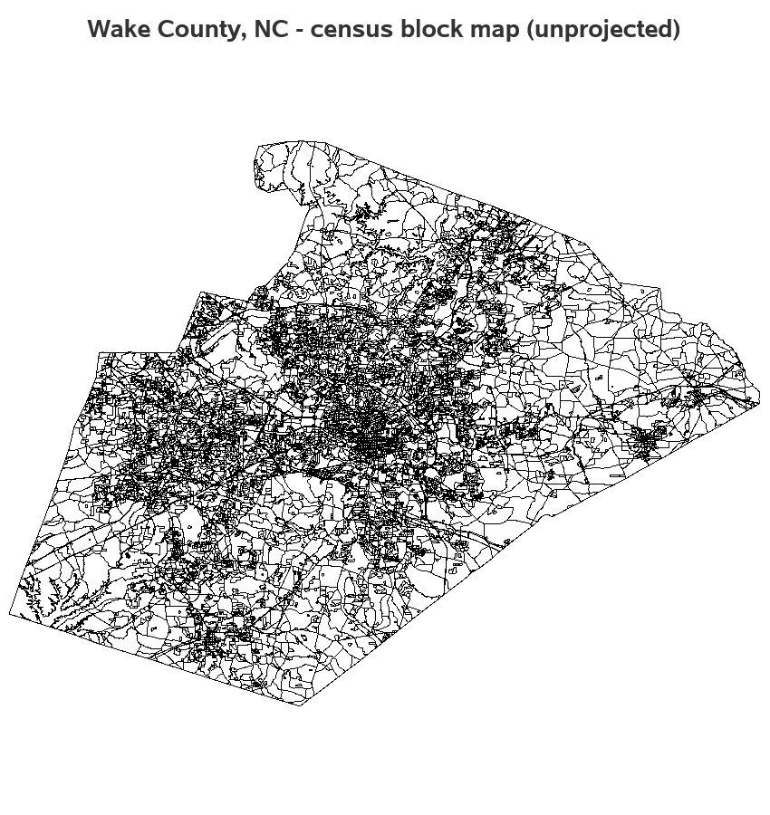
If we do a preliminary choropleth map, you might notice it looks a little squished in the north/south direction (you have to look very carefully to notice!). This is because the coordinates are unprojected latitude/longitude values.
proc sgmap mapdata=wake_blockmap noautolegend;
choromap / mapid=blockid10 lineattrs=(thickness=1);
run;
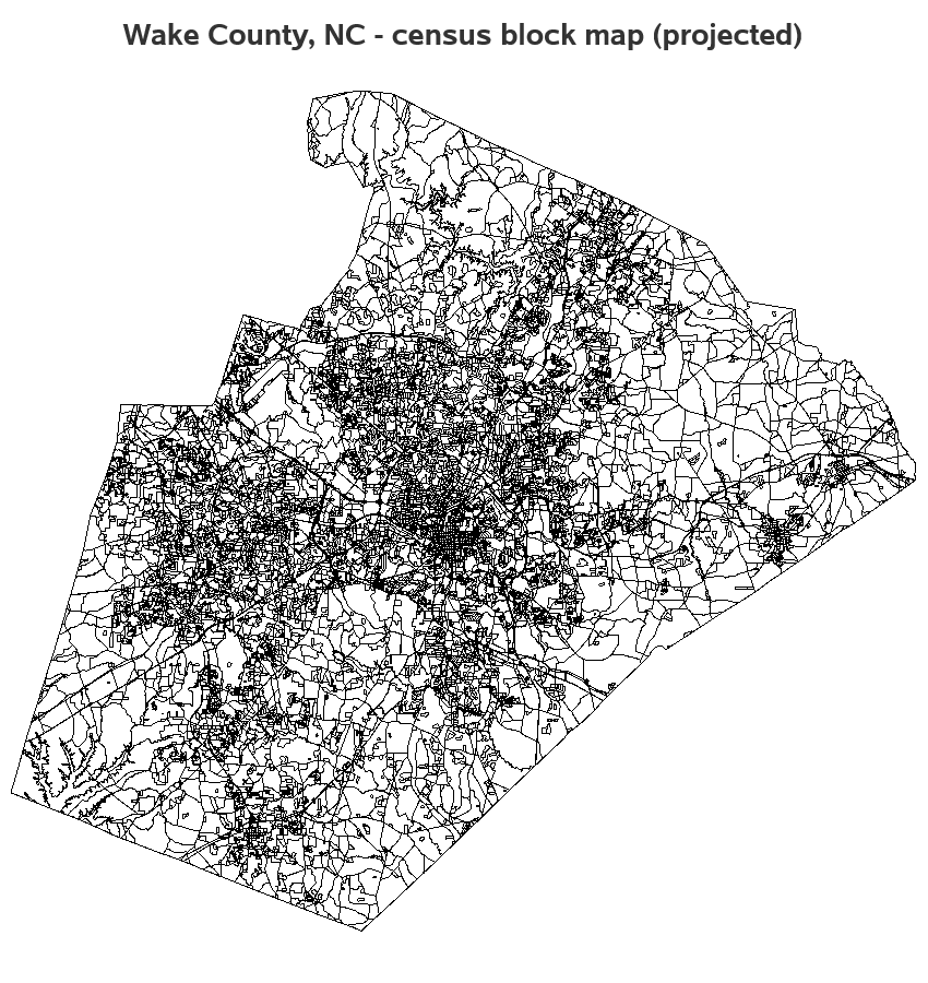
We can use Proc Gproject to project the coordinates, and get the (not squished looking) county map we're accustomed to seeing. Note that I'm using the parmout= option to save the projection parameters, so I can re-use them later.
proc gproject data=here.wake_blockmap out=wake_blockmap eastlong degrees parmout=projparm;
id blockid10;
run;
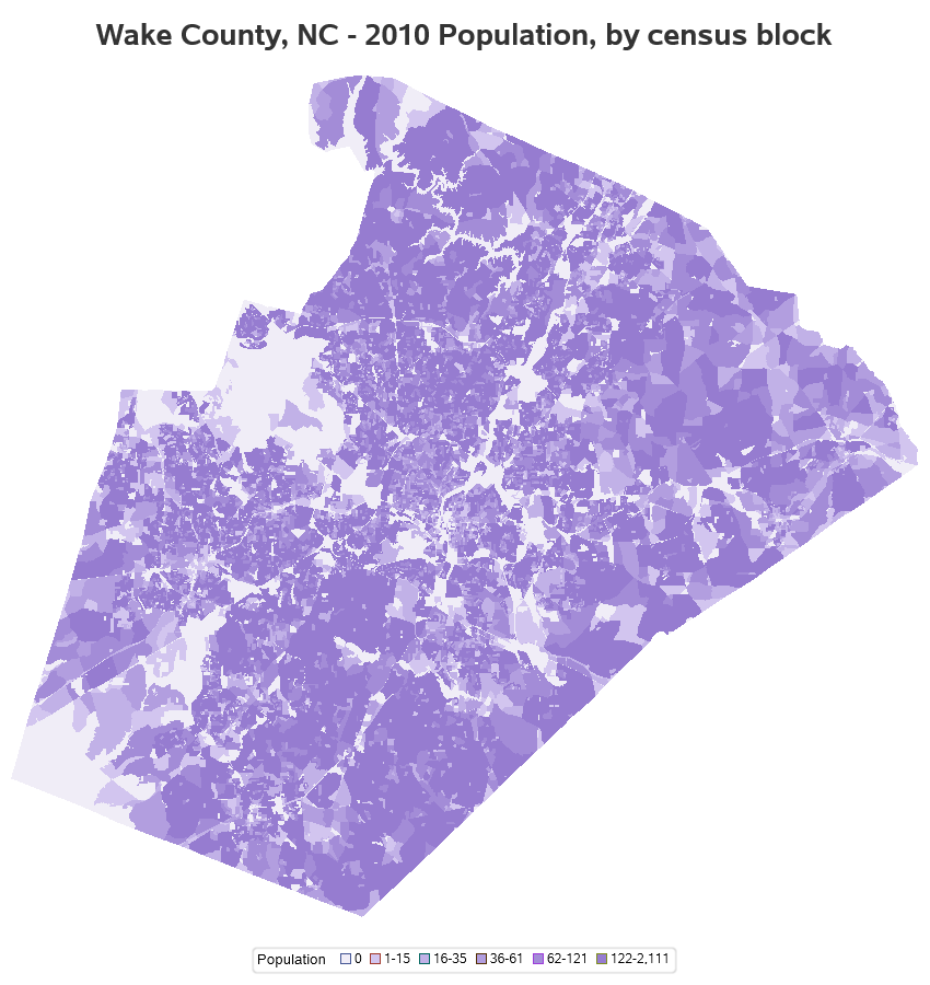
Plotting the Census population data
Now that we have the map ready, let's plot the population data on it. The Census ships the population data with the map shapefile. When we import the shapefile into a SAS map dataset, the population is repeated with every x/y point of every polygon. We only need 1 population value for each Census block, therefore I use Proc SQL to get a list of the unique values.
proc sql noprint;
create table pop_data as
select unique blockid10, pop10
from wake_blockmap;
quit; run;
I can now use the following code to plot the population ranges as a color shades on each choropleth map polygon. (There's a little more going on behind the scenes, using a data step to determine the 'range' values, and a user-defined-format to make them show as the desired ranges in the legend, and using an ODS style to control the colors - see the full code for all the details!)
proc sgmap mapdata=wake_blockmap maprespdata=pop_data noautolegend;
choromap range / mapid=blockid10 id=blockid10 name='popmap' lineattrs=(thickness=0);
keylegend 'popmap' / title='Population';
run;
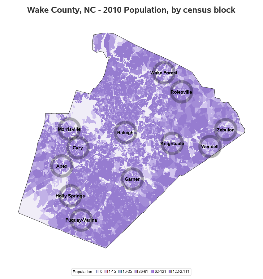
Finishing touches
The map above is a fine map, showing the population data ... and you could stop there if you like. But I wanted to add a few reference points to make the map a little easier to relate to. In this case, I add city labels and circle markers (overlaying a scatter and text plot), and a county border around the map (overlaying a series plot). The 'trick' here is that I start with latitude/longitude values, and project them using the same projection parameters I used for the map itself (which I had saved in the projparm dataset). I have to combine all these extras into one 'plotdata' dataset, therefore I rename the x and y variables so I can use them separately in the sgmap scatter and text statements.
data county_outline; set mapsgfk.us_counties (where=(statecode='NC' and county=183));
run;
proc gproject data=county_outline out=county_outline latlong eastlong degrees
parmin=projparm parmentry=wake_blockmap;
id state county;
run;
data cities (keep = lat long city);
set maps.uscity (where=(statecode='NC' and county=183 and pop>300));
long=long*-1;
run;
proc gproject data=cities out=cities latlong eastlong degrees
parmin=projparm parmentry=wake_blockmap;
id;
run;
data all_plot; set
county_outline (rename=(x=county_x y=county_y))
cities (rename=(x=city_x y=city_y));
run;
proc sgmap mapdata=wake_blockmap maprespdata=pop_data noautolegend plotdata=all_plot;
choromap range / mapid=blockid10 id=blockid10 name='popmap' lineattrs=(thickness=0);
scatter x=city_x y=city_y / markerattrs=(symbol=circle size=65pt color='black') transparency=.7;
text x=city_x y=city_y text=city / textattrs=(color=black size=11pt weight=bold);
series x=county_x y=county_y / lineattrs=(color=gray33 thickness=1px);
keylegend 'popmap' / title='Population';
run;
Hopefully you've learned a few tricks you can use to help analyze the Census data at the block level. What other things besides population might it be interesting to show on a block map? Feel free to leave comments/suggestions in the comments section below!


3 Comments
The census blocks are much smaller in the cities and towns, which kind of flattens the result. Is there a way to get the areas of the tracts, and then plot the population densities?
I don't know of a way in SAS/Graph or Base SAS (built-in) to calculate the areas of the Census block polygons, to then calculate the densities.
I was looking for a way to do a proportional symbol map; it looks like SGMAP with the choromap statement may be a good place to start.